


Most teams only focus on forecast accuracy when something goes wrong: unexpected stockouts, excess inventory that lingers, or budgets that drift because demand didn’t match the spreadsheet.
According to APQC, the median monthly forecast accuracy is just 82%, meaning nearly one in five units is misforecast. That gap is what drives operational surprises.
A big contributor is the continued reliance on spreadsheets, which can’t adapt quickly when demand shifts, new SKUs launch, or supplier performance changes.
We break down key forecast accuracy formulas, how to calculate them in Excel, where Excel limits visibility, and how automation helps maintain accuracy as you scale.
Forecast Accuracy Formulas You Can Calculate in Excel
Improving forecast accuracy starts with choosing the right error metric for your data, especially if you're calculating in Excel.
Below are the most commonly used formulas to calculate accuracy, along with their Excel equivalents.
1. MAPE Forecast Accuracy Percentage Formula
MAPE (Mean Absolute Percentage Error) expresses forecast error as a percentage of the actual value, making it easy for stakeholders to understand at a glance.
It provides a consistent, comparable metric across products, regions, or customer segments and is widely used in dashboards and performance scorecards.
Formula: MAPE = (1/n) × Σ |(Actual – Forecast) / Actual|
Excel calculation: If Actuals are in column A and Forecasts in column B:
=AVERAGE(ABS((A2:A13 - B2:B13) / A2:A13))
Use MAPE forecast accuracy formula when
- You need a simple, interpretable “forecast accuracy %”
- You want consistency across large or diverse datasets
- You’re reporting accuracy to non-technical audiences
Avoid MAPE when
- Actual values are zero or close to zero, results become distorted.
2. WMAPE Forecast Accuracy Formula for High-Volume SKUs
WMAPE (Weighted Mean Absolute Percentage Error) measures forecast accuracy by weighting errors based on actual demand volume. This makes it ideal when a small set of high-volume SKUs drives most of your revenue or operational risk.
Unlike standard MAPE (which treats all items equally), WMAPE gives more influence to SKUs that matter most, producing a more realistic view of accuracy across large assortments.
Formula: WMAPE = Σ |Actual − Forecast| ÷ Σ Actual
Excel calculation: If Actuals are in column A and Forecasts in B:
= SUM(ABS(A2:A13 - B2:B13)) / SUM(A2:A13)
Use weighted forecast accuracy formula when
- Managing large SKU portfolios or retail replenishment
- Working with uneven demand concentration
Unlike MAPE, WMAPE remains stable when actual values are small and prevents low-volume SKUs from distorting overall forecast accuracy.
3. MAE / MAD Forecast Accuracy Formula
MAE (Mean Absolute Error), also known as MAD (Mean Absolute Deviation), measures forecast error in units, not percentages. This makes it highly actionable for purchasing, inventory planning, production, and logistics teams.
Where MAPE or WMAPE answer “How accurate were we in percentage terms?”, MAE/MAD answers the more practical question: “On average, how many units were we off by?”
Formula: MAE = Σ |Actual − Forecast| ÷ n (number of periods or observations)
Excel calculation: If Actuals are in column A and Forecasts in B
=AVERAGE(ABS(A2:A13 - B2:B13))
Use MAE/MAD when
- Planning materials, capacity, or labor
- Adjusting safety stock
- Measuring operational impact in absolute units
Because MAE/MAD is unit-based, it avoids percentage distortions that occur with very small or highly variable actuals.
4. RMSE Forecast Accuracy Formula for Large Error Sensitivity
RMSE (Root Mean Squared Error) puts extra weight on large errors by squaring each deviation before averaging. This highlights major misses that can cause significant financial or operational disruption.
Unlike MAE (which treats all errors equally), RMSE penalizes big spikes, making it useful in environments where one large forecasting mistake can outweigh many small ones.
Formula: RMSE = √( Σ (Actual − Forecast)² ÷ n )
Excel calculation: If Actuals are in column A and Forecasts in B
=SQRT(AVERAGE((A2:A13 - B2:B13)^2))
Use RMSE when large errors are costly, such as in
- Capacity planning
- Financial forecasting
- Transportation and workforce planning
- Capital-intensive operations
Because RMSE amplifies outliers, it’s best paired with MAE or WMAPE to provide both everyday accuracy and risk sensitivity.
Advanced Forecast Accuracy Formulas
As forecasting matures, basic accuracy metrics (like MAPE or MAE) are often not enough. More advanced formulas, such as sMAPE and MASE help diagnose volatility, scale differences, and systematic bias.
Learn how to calculate these below.
1. sMAPE Forecast Accuracy Formula
sMAPE (Symmetric Mean Absolute Percentage Error) reduces distortion when actual values are very small by normalizing error using both actual and forecast values.
Formula: sMAPE = (1 / n) * Σ ( |Actual − Forecast| / ( (Actual + Forecast) / 2 ) )
Use sMAPE when demand is volatile, product volumes vary widely, or traditional MAPE becomes unstable.
2. MASE Forecast Accuracy Formula
MASE (Mean Absolute Scaled Error) compares your forecast against a naive baseline (typically the previous period’s actual) and is completely scale-independent, making it useful across categories with different units or volumes.
Formula: MASE = ( Σ |Actual − Forecast| / n ) ÷ ( Σ |Actual − Previous Actual| / (n − 1) )
Interpretation
- MASE < 1 = better than naive
- MASE = 1 = same as naive
- MASE > 1 = worse than naive
You can use MASE for model benchmarking, AI vs. statistical forecast comparison, and cross-category evaluation.
3. Tracking Signal Forecast Accuracy Formula
Tracking Signal is a forecast accuracy and bias formula that identifies whether forecasts consistently over- or under-forecast by comparing cumulative error to average error.
Formula: Tracking Signal = Cumulative Forecast Error / Mean Absolute Deviation (MAD)
Where
- CFE = Σ (Actual − Forecast)
- MAD = MAE
Interpretation
- Between −4 and +4 = stable
- Above +4 = under-forecasting
- Below −4 = over-forecasting
Use Tracking Signal to monitor planner bias, model drift, and sales and operations forecast discipline.
How to Build a Forecast Accuracy Formula Dashboard in Excel
If you want to build your forecast accuracy formula in Excel, here is a step by step you can follow:
Step 1: Set up your raw data
Start by organizing Actuals and Forecasts in a clean table. Every formula (MAPE, WMAPE, MAE/MAD, RMSE, etc.) relies on consistent row-level comparisons.
Your dataset should include at least
- Date or Period (Month, Week, Day)
- SKU or Product ID
- Actual Demand
- Forecasted Demand
- Category, Region, Customer, Channel (optional for deeper analysis)
Few tips to maintain data hygiene
- Leave no blank rows; use consistent headers
- Keep numbers numeric (no symbols or text in number cells)
- Combine multiple sources into one table to avoid formula errors
- Convert to an Excel Table (Ctrl + T) so formulas and pivots auto-expand
A well-structured table makes formulas, pivots, and visuals much easier.
Step 2: Add your accuracy formulas
Once your raw data is structured, calculate forecast accuracy at the row level. This allows you to aggregate performance reliably in pivot tables and dashboards. Calculating only at the total level hides variation, so each SKU, period, or location needs its own error metrics.
Add columns for the accuracy formulas you want to track, such as
- Absolute Error
- MAPE
- WMAPE components (Absolute Error and Actual)
- MAE / MAD
- RMSE components (Squared Error)
Example of additional columns
Core formulas to apply at the row level
- Absolute Error = ABS (Actual − Forecast)
- MAPE = ABS ((Actual − Forecast) / Actual)
- Squared Error (for RMSE) = (Actual − Forecast)^2
Key setup tips
- Use Excel Tables so formulas auto-fill as new rows appear
- Handle divide-by-zero in MAPE with an IF(Actual=0,…) condition
- Keep formulas consistent across all rows to avoid distorted pivot table results
Calculating these components at the record level enables clean, accurate aggregation when you build your pivot tables and dashboard in the next step.
3. Build a pivot table
With your accuracy formulas in place, the next step is to summarize the data using a Pivot Table.
- Select your entire data table (including the new formula columns)
- Go to Insert → PivotTable and place it on a new worksheet.
- In the PivotTable Fields panel, drag
- Date/Month into Rows
- SKU, Category, or Region (optional) into Rows or Filters
- Absolute Error, MAPE, Squared Error into Values
- Set the correct aggregations
- Absolute Error → Sum
- MAPE → Average
- Squared Error → Average (for RMSE later)
The Pivot Table becomes your accuracy dashboard, generating instant summaries by time period, SKU, category, region, or customer.
4. Add conditional formatting
Conditional formatting makes good and poor forecast accuracy easy to spot.
- Select the MAPE (or other error) values in your Pivot Table
- Go to Home → Conditional Formatting
- Choose
- Color Scales to show high vs. low error visually, or
- New Rule to define your own thresholds.
A common color scheme looks like
- Green = low error (good accuracy)
- Yellow = moderate error
- Red = high error (poor accuracy)
Apply the rule to all value cells so it updates automatically as filters change. This turns your Pivot Table into a visual tool that highlights where forecast performance is breaking down.
5. Build visual charts
Charts turn your Pivot Table into a real dashboard by highlighting accuracy trends and problem areas.
- Click anywhere inside your Pivot Table.
- Go to Insert → PivotChart.
- Choose a chart type based on what you want to show
- Line chart for accuracy trends over time
- Bar chart for comparing SKUs, categories, or regions
- Column chart for period-over-period error changes
- Place the chart next to your Pivot Table on the worksheet.
- Remove unnecessary gridlines and labels so the chart stays clean and readable.
The chart will update automatically whenever the Pivot Table changes, giving you a live visual view of forecast accuracy.
6. Add filters for deeper breakdown
Filters (slicers) let users drill into forecast accuracy by SKU, category, region, customer, or time period.
- Click inside the Pivot Table
- Go to PivotTable Analyze → Insert Slicer.
- Select the fields you want to filter by (e.g., SKU, Category, Region, Customer, Month)
- Click OK to add the slicers, then position them next to your charts
Users can now click any slicer to instantly filter the Pivot Table and charts, making the dashboard interactive and enabling detailed root-cause analysis without modifying formulas.
When Excel Isn’t Enough and Forecast Accuracy Formula Automated Alternatives
Excel is a great starting point for calculating forecast accuracy, but as your business grows, inventory tracking spreadsheets begin to struggle with the volume, complexity, and pace of data changes.
Accuracy becomes harder to maintain and interpret, especially when formulas, tabs, and reports all depend on manual updates. At this stage, automation often becomes the natural next step.
Where Excel starts to create challenges
- Managing large SKU catalogs becomes time-consuming, and formulas need constant updates as new products are added
- Forecast accuracy changes daily as sales and stock shift, but spreadsheets only update when someone manually refreshes them
- Multi-warehouse or multi-store setups require separate sheets or fragile cross-references that break easily
- Supplier delays or shifting lead times aren’t reflected automatically, reducing the reliability of accuracy measures
- Seasonal trends or demand spikes can distort results unless sheets are manually adjusted
- Dashboards, charts, and PivotTables must be rebuilt or reconfigured whenever new data or formats change
How Prediko helps at this stage
Prediko gives you everything Excel cannot handle once your forecasting needs grow. Each feature links directly to your forecast accuracy
- Real-time data sync: Prediko updates your sales, stock, and purchase data automatically, so your forecast accuracy stays current without you touching a spreadsheet.
- SKU-, variant-, and location-level accuracy: Prediko calculates accuracy for every product, variant, and warehouse/store. This solves a key Excel limitation where granular accuracy becomes too messy or slow to maintain.
- Lead times and safety stock adjustments: With Prediko, you can input lead times for each supplier as well as safety stock. It automatically adjusts forecasts based on them, reflecting real-world conditions instead of ideal assumptions.
- Seasonality and trend adjustments: Seasonal peaks, new product launches, slowdowns, and demand spikes are built directly into Prediko’s forecast model. This prevents the common Excel problem where seasonal variation distorts accuracy formulas.
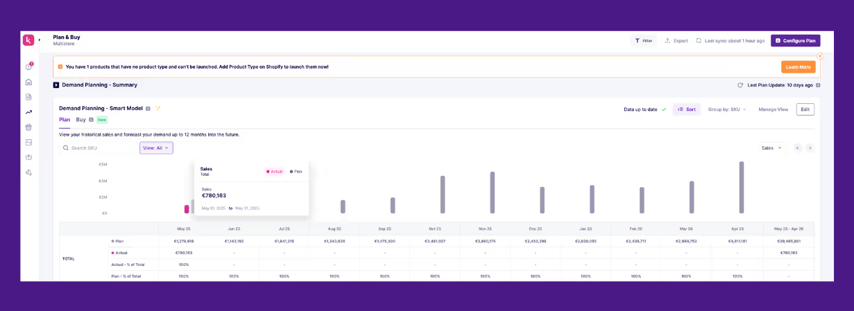
- Automatic dashboards and reporting: Prediko shows clean, ready-to-use actual vs planned data and charts. No more building PivotTables, conditional formatting, or charts manually; everything updates instantly.
- Multi-store and multi-warehouse support: With Prediko, you can handle complex networks with ease and compare accuracy across locations without duplicating data or formulas.
- Seamless integration with your existing tools: Prediko connects to 70+ ecommerce, ERP, WMS, and fulfillment platforms, eliminating the need for manual exports or imports to keep your data and forecasts up to date.
What to Look for in Automated Tools That Calculate the Forecast Accuracy Formula
When evaluating automated tools that calculate forecast accuracy, focus on the capabilities that genuinely improve day-to-day planning. Here’s what matters most.
- The tool should offer accurate, transparent forecasting models that incorporate seasonality, trends, promotions, and growth patterns.
- Data should refresh automatically based on live sales, stock movements, receipts, and new SKU launches, without relying on manual CSV uploads.
- The system must handle multi-store, multi-warehouse, and multi-channel setups so accuracy can be compared across locations without duplicating spreadsheets.
- Lead times, safety stock, and days of cover should be integrated into the forecasting logic to reflect real operational conditions.
- It should provide real-time reports/dashboards with drill-down capability, allowing users to explore accuracy by SKU, category, channel, region, or supplier.
- Multi-user access ensures all teams work from the same data rather than sharing conflicting spreadsheets.
- The platform must integrate directly with ecommerce, ERP, WMS, and fulfillment systems to keep metrics always up to date.
- It should scale easily as SKU counts, sales channels, and warehouse networks grow, without requiring additional manual setup.
The good news is that Prediko checks every box on this list, providing all the capabilities needed to measure and improve forecast accuracy reliably as your business scales.
Forecast Accuracy Formula Comparison: Excel vs Automation
As forecasting needs mature, it becomes important to understand how Excel compares to automated tools for calculating and managing forecast accuracy.
Excel offers control and flexibility but requires constant manual upkeep. Automated tools eliminate that maintenance burden and keep accuracy metrics current as your business evolves.
Below is a side-by-side look at where each approach performs well and where it begins to fall short.
Take Control of Your Forecast Accuracy
Strong forecast accuracy depends on clean data, clear formulas, and processes that update reliably as your business grows. Excel can manage the basics, but as SKU counts increase, locations multiply, and data moves faster, manual methods start slowing down decisions.
Prediko gives you a simpler, more reliable way to maintain forecast accuracy without managing formulas, dashboards, or imports.
It syncs your data automatically, calculates accuracy across every SKU and location, and adjusts for supplier lead times and seasonality, so your numbers stay dependable and your team spends less time fixing spreadsheets.
Set it up once, keep your data flowing, and let automation handle the rest. If you want to see how it performs with your own catalog, you can try Prediko free for 14 days.